CHX·Live
⌘K
UTC—/— —:—:—
Two Arctic maps compare changes in melt season length by decade. Red indicates areas where the season grew longer; blue, where it grew shorter. The 2000–2009 map is mostly dark red. The 2010–2023 map shows a mix of lighter red and blue, indicating smaller changes.
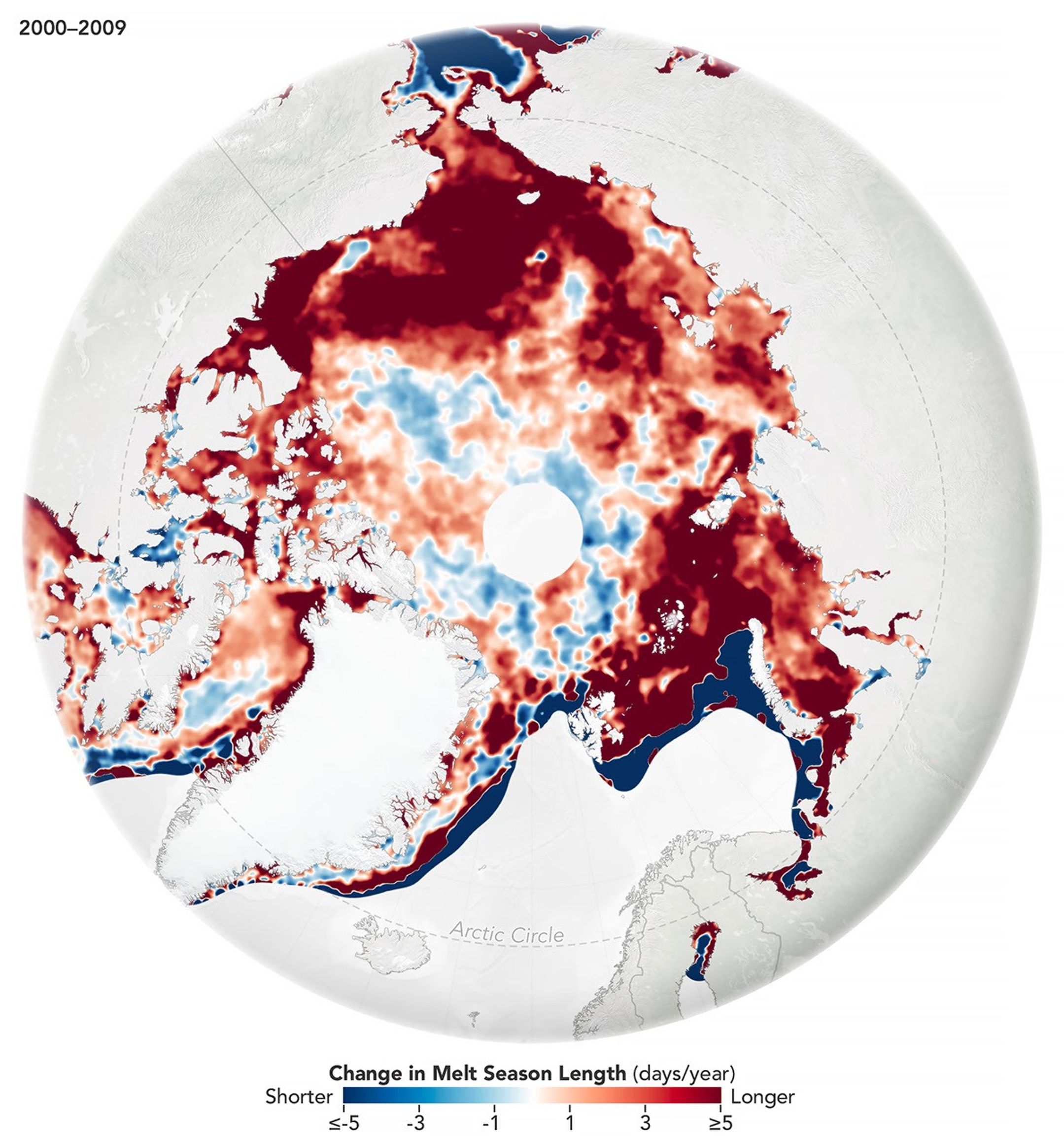
Two Arctic maps compare changes in melt season length by decade. Red indicates areas where the season grew longer; blue, where it grew shorter. The 2000–2009 map is mostly dark red. The 2010–2023 map shows a mix of lighter red and blue, indicating smaller changes. 图:NASA · NASA Image and Media Guidelines
署名图:NASA
原始出处science.nasa.gov
尺寸2159 × 2324 · JPG

本图来自 science.nasa.gov,转载自公开渠道。如有侵权请联系 [email protected] 删除。